Reconstructing the structure of the world-wide music scene with Last.fm
Inspired by the Internet mapping efforts of the Opte Project, I decided to investigate how does the network of musicians look like. Those ugly hairballs below are the results. Okay, they do not look as nice as the Internet maps, but the tree-like structure of the Internet must have helped a lot to create those fancy maps.
There's a menu up there. Check out the rest of this website if you are interested in technical details or if you want to waste a lot of time. Otherwise, just read on.
Just the basic facts
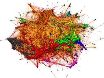
Basically: this is a graph representation of the similarity relationships derived from the database of Last.fm. The circles (vertices) on the left hand side figure are bands, musicians, composers, whatever you will find in the Music section of the site. Lines (edges) connect similar artists. In order not to make the whole thing an ugly hairball (well... it is still an ugly hairball, but not as ugly as it could be), only a subset of all existing connections are displayed. Last.fm quantifies artist similarities in a scale of 100 points - I dropped connections below 80, mostly because the degree distribution follows a nice power law at this cutoff level. Edges are colored according to their centrality in the network, from white to dark gray in a nice logarithmical gradient (the visualisation with black background use a different palette from black through red and yellow to white). Insignificant edges are more transparent than significant ones. Vertex sizes vary according to the popularity of the artists. It is not very surprising that the largest vertices are not those that were the most influential in the history of music ;) Vertex colors correspond to musical genres, identified by tags attached to the artists by the users of Last.fm - so don't blame me if an artist is seemingly miscategorised :) Rock is red, , electronic is orange, hip-hop and rap is blue, jazz is yellow, reggae and ska is magenta, classical music is cyan, country, folk and world music is brown, pop is green. Light grey vertices are unclassified. See the technical details if you are interested in how the categorisation was done.
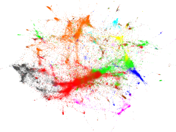
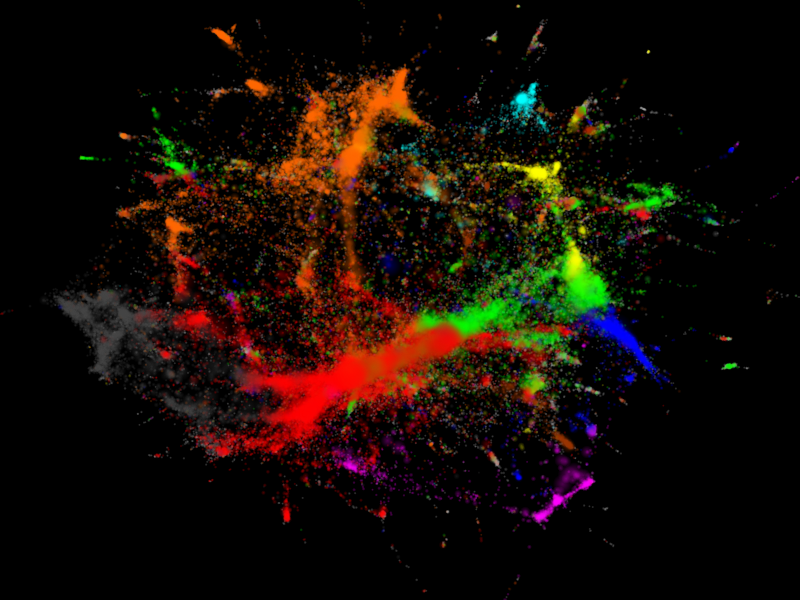
The right hand side figure is almost the same, but the edges are not drawn and musicians are represented by small coloured dust particles where the area of the particle is proportional to the popularity of the given artist. Although every single dust cloud should be circular, the inhomogenous density of the vertices give rise to that pattern you see - like some paint splatted on the wall. Actually, it looks better on black background.
There are many variants of these figures available for download. There is also an interactive map - just type the name of your favourite band and see where it is in the graph.
Notable mentions
On the web:- Wired.com (Listening Post)
- The Guardian
- build.last.fm
- Duke Listens! (Paul Lamere)
- Tech Digest
- Visualizing Music
- Óscar Celma: Music Recommendation and Discovery (cover art)